We know what I want to develop, see The First Application - Emergency List. As its an iPhone app, the first step is to draw up the user interface. In this post we’ll look at a mockup of the interface and some of the thinking behind it.
The Interface - Favorites
The first requirement is that it should take only two taps to call an emergency number, tap once to launch the app, tap again to call the emergency number. When the application launches, it should look something like this:
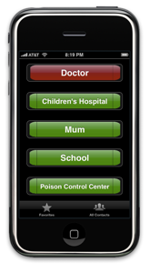
If the user has no favorites, such as when they first use the app, it should display instructions on how to use the application.
The Interface - All Contacts
The second requirement is to provide an interface for all contacts and the ability to edit them. So I decided to use a tabbed interface design, one tab for favorites, the next for the full list. When the user presses the second tab at the bottom of the app, they should get:
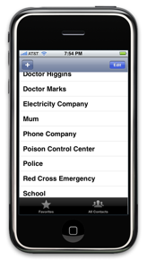
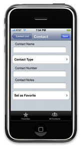
The app should show a list of contacts, allowing the user to dial, create or edit contacts. If the user chooses to edit a contact, maybe show something like this:
Decisions made in this design iteration
- Using a tabbed interface for the application, since it really has two ways to view the data
- Sticking to default iPhone UI conventions instead of drawing my own, so it makes it easier for the user to interact with the app
- Added a contact type to help decide on the icon for each contact, the design and use of which to follow. Decision made because key symbols, such as a red cross for a hospital, are easy to see and recognize.
Decisions to be made in the next design iteration
- Using red and green to differentiate buttons is not smart as a large proportion of the planet is red/green colorblind, use icons instead?
- Should it show the contact number on the hot buttons? This will be required for users of the iTouch, but may make the text too small to see in an emergency situation
- Show the comment/detail line on the button too?
- Do I need a third tab for help? An about page?
The How?
Note that at this point all we have is a draft design of the application user interface, including its navigation. As a designer, I have not yet moved on to how the application will be developed or how it will store its data. Stick around, it will come soon.