Continuing the story of my first iPhone application as an Indie Developer, starting with why in Becoming Better, the requirements in First Application - Emergency List and last week’s First Draft Application Design - Emergency List. In short, I am documenting all the successes and failures in developing my first iPhone app.
After One Week’s Coding
After a week of coding, the following functionality has been developed. All screenshots are taken from my development iPod Touch, they are not mockups.
Favorites
The favorites page is shown as soon as the app is launched. It sure looks like the mockup.

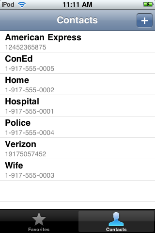
All Contacts
Hit the contacts tab, and the app displays an alphabetically sorted list view of all emergency contacts in the app.

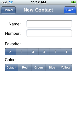
Add New Contact
Tap the plus button at the top to bring up a modal add new contact sheet.

Tap Save to create the new contact or cancel to get rid of the sheet without saving.
Edit Contact
Tap a contact in the list view to edit it.

All changes are saved in real time so the user can flip to the favorites tab to see how it looks.
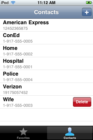
Swipe to Delete Contact
Swipe a contact on the list to delete it.

So am I done?
One could argue that the app as it stands has met all the requirements outlined in the application design. Corporate programers would deliver this and walk away. I believe that I am at maybe 20% of the way, and this is why.
- The favorites panel has too much white space. My wife took one look at it and declared that she would prefer the buttons to take up the whole screen, to make it easier to tap in an emergency. She prefers a non-standard interface that adjusts for the number of buttons and uses the whole screen. I think she’s right and need to experiment with designs.
- Each contact looks the same, we need icons or graphics or images to attract the eye. People recognize symbols faster than they can read text, so using a house icon for home, a red cross for hospital, shield for police will make it easier to recognize the target in an emergency.
- The input form does not tell the user if a button is in use or not. Tapping an in-use button in the current version brings up an alert that tells the user which contact is already on that button and allows them to change. Maybe a visual display of in-use buttons would be better.
- The font sizes on the input form drive me nuts. The label and the text fields are standard iPhone UI items, but I think the input text is too small. A new design is required here.
- The input form is boring, and has a whole bunch of white space at the bottom. It’s unbalanced, and uncool. Redesign.
- There are no application graphics (other than the button background images). The favorites screen needs something, I need an icon for the app and a splash screen.
- There is no place on the application to tell the users who I am, or how to use the app. That needs to be added.
What about the non-UI stuff, the code?
The code has been through one iteration and one refactoring this week. I have learned all about view controllers in the iPhone UI, how to debug EXC_BAD_ACCESS errors, learned some UI tricks and techniques, written and rewritten the code to view and edit each contact.
I am using a simple NSArray of NSDictionary items saved to a .plist file to store the data and wrapped that up in an encapsulated class so I can change the internals at any time. The design of this class assumes a single contact is current so I have no need to encapsulate the NSDictionary records in another class. This will probably change.
The first refactoring separated the data into a model class and uses the controllers to hang between the views and the model. It also allowed me to reuse the edit form for add new so that the code and layout need not be duplicated.
Next Step
Lots to do, first on the UI and then in the code. Next steps, playing with the favorites view to see if I can come up with a better paradigm.
