Part 4 in the continuing the story of my first iPhone application as an Indie Developer, starting with the requirements, the design and last week’s first iteration. In short, I am documenting all the successes and failures in developing my first iPhone app.
UI Updates
The best way to read this article is to open the previous article in another window so you can see the UI changes.
Favorites
I was very unhappy with the look and feel of the favorites page. Its the first view the user sees and it needs to be self explanatory, that tapping a button makes a call. We did not like the excessive white space and the small buttons. I also felt that the human eye recognizes symbols faster than text, so those are needed too. So the whole view was reworked to look like this:
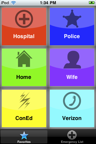
We’re using brighter colors, larger text and symbols to match. Sure looks better that the last iteration. However, the buttons themselves do not yet say clearly that they are “tap to call” shortcuts.
Emergency List
I changed the name and icon of this tab because the users I showed this to confused the emergency list and the contacts app on the iPhone. They were looking for their other contacts. By renaming the tab, the confusion seems to have been cleared up.
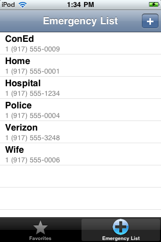
There is much that can be done to this view, such as showing the icon, adding a call button and adding some additional info for each contact.
Add New/Edit Contact
This view has been transformed to follow the look and feel of the contacts and the calendar apps on the iPhone. Tapping any row brings up an edit or lookup view.
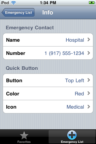
I think this new UI looks much cleaner and gives me more flexibility to add visible features while maintaining a common UI theme.
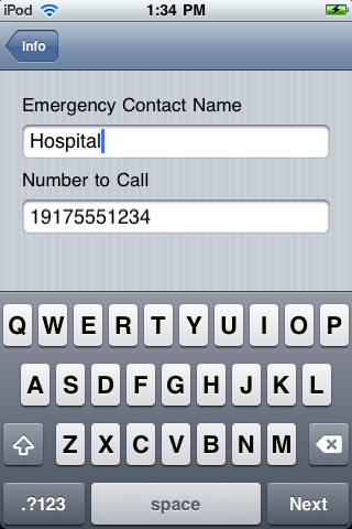
Tapping the name or number gives:
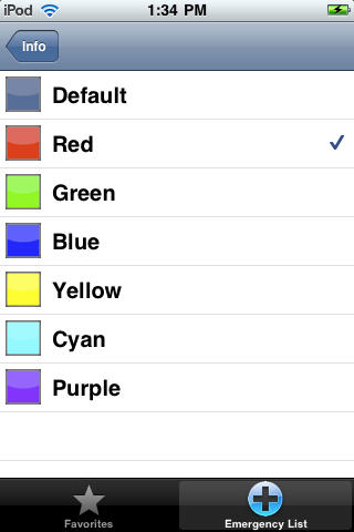
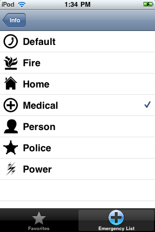
The others are:
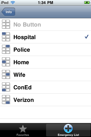
Note that the selected button is checked, you know what button is being used by which contact, and there are graphics to help show which button it will be.
Changes in the Code
One of the coolest changes in the code is how the graphics are made and presented.
Each button on the favorites screen is composited on the fly. A contact’s color choice is composited with the contact’s icon choice and presented as the default state of the button. A second composite image with a gray background is generated on the fly to act as the depressed button image.
Different stuff happens on the lookup screens. On the colors lookup, each button graphic is on-the-fly scaled to fit on the row. On the icons lookup, each icon image is cropped and then scaled to fit on an icon row.
This way, I only need to generate the original images and not have to maintain multiple sizes, combinations and styles for each view. CoreGraphics rock!
So Am I Done?
Uh, no, not even close.
- The app has no icon, splash screen or info on how to use it. And contains nothing about me.
- The favorites buttons still need to look more “tap to call” like.
- I need more colors (the wife wants pink) and icons.
- The code is starting to get messy and duplicated. The mess is coming from the fact that I am learning CoreGraphics and have lots of experimental code in there. All three lookup screens are essentially the same code, and we all know code duplication is bad.
- Titles on the lookup views
- Add contact from address book
Next Step
Clean up the code, add application graphics and add some help for the user somewhere.
